Understanding Correlation
Learn correlation and its limitations
What You'll Learn
- Pearson correlation
- Interpreting correlation
- Correlation vs causation
- Common mistakes
Correlation Basics
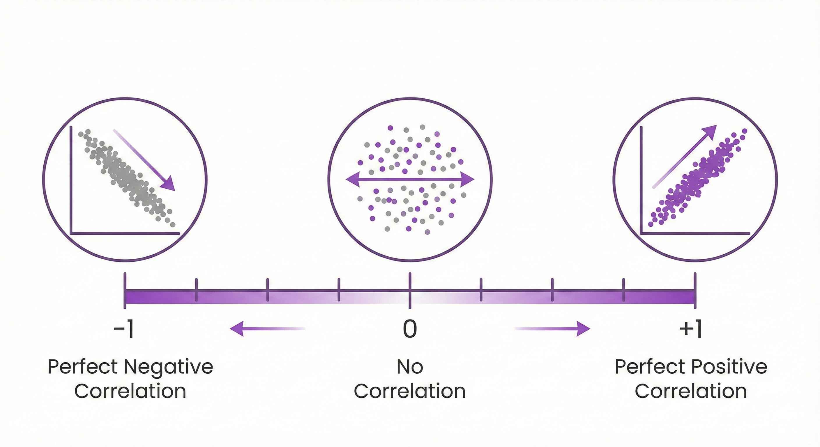
What it measures: Strength of linear relationship between two variables
Range: -1 to +1
- +1: Perfect positive correlation
- 0: No correlation
- -1: Perfect negative correlation
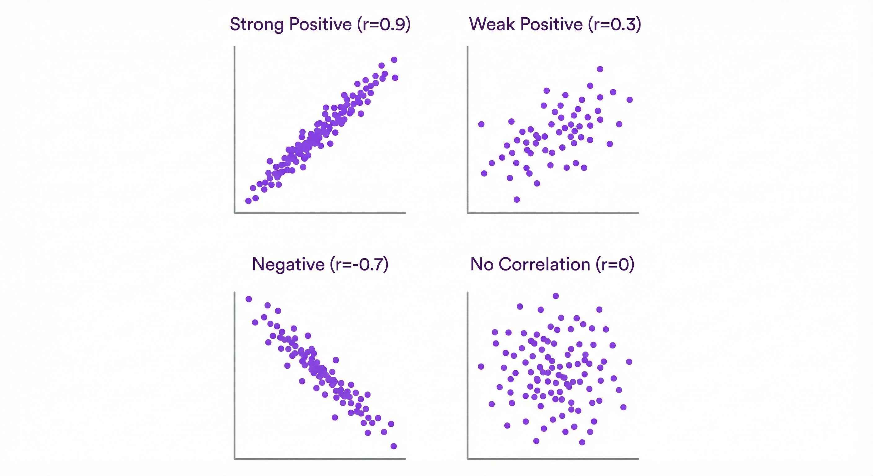
Pearson Correlation (r)
Formula: r = Cov(X,Y) / (SD_x × SD_y)
Interpretation:
- r > 0.7: Strong positive
- r = 0.3-0.7: Moderate
- r < 0.3: Weak
- Negative values: Inverse relationship
Excel: =CORREL(X_range, Y_range) Python: df.corr() or scipy.stats.pearsonr(x, y)
Visualizing: Scatter Plots
Always plot your data!
Patterns:
- Upward slope: Positive correlation
- Downward slope: Negative correlation
- Cloud: No correlation
- Curve: Nonlinear (correlation misleading!)
Correlation ≠ Causation

Classic mistake: Correlation doesn't prove one causes the other!
Examples:
- Ice cream sales & drowning (both caused by summer!)
- Shoe size & reading ability in kids (both caused by age!)
Remember: Association ≠ Causation
Limitations
Only measures linear relationship: Could be strong nonlinear but r=0
Sensitive to outliers: One extreme point changes r
Doesn't show direction: X causes Y? Y causes X? Third variable?
Spurious Correlations
Meaningless correlations:
- Nicolas Cage films & pool drownings
- Cheese consumption & bed sheet deaths
Lesson: Don't data mine for correlations!
Practice Exercise
Data: Hours studied: 1, 2, 3, 4, 5 Test score: 60, 70, 75, 85, 90
Calculate correlation coefficient.
Next Steps
Learn about Confounding Variables!
Tip: Correlation is first step, not conclusion!