Module 10
6 min read
Dashboard Design Principles
Learn to design effective, user-friendly dashboards
What You'll Learn
- The golden rules of dashboard design
- Layout patterns that work
- Colors that communicate
Rule 1: Less is More
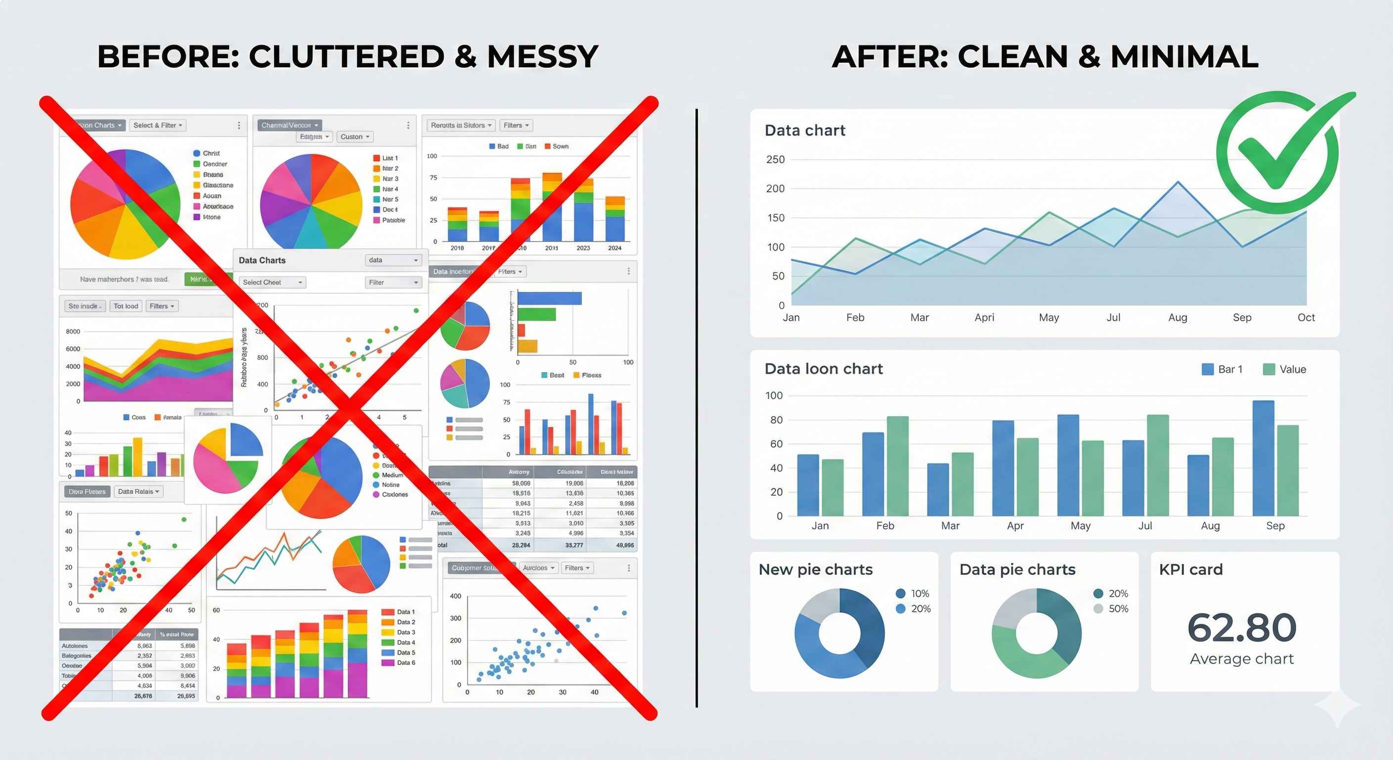
Bad Dashboard:
- 20+ visuals crammed together
- Rainbow colors everywhere
- 3D charts and effects
- Users feel overwhelmed
Good Dashboard:
- 5-7 focused visuals
- Clean color palette
- Simple, clear charts
- Users find answers fast
Rule 2: F-Pattern Layout
Users naturally scan in an F shape. Design for it!
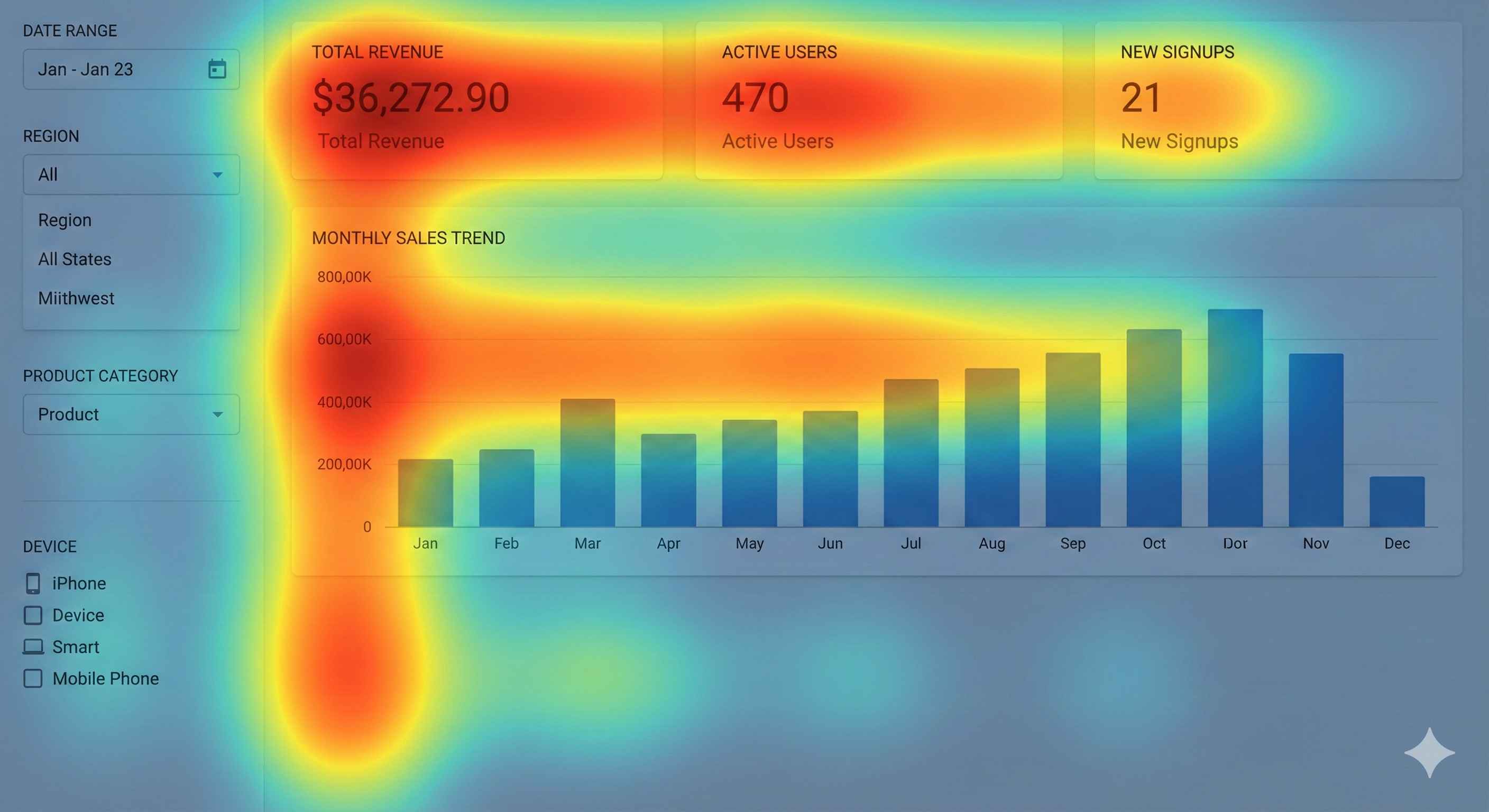
| Position | What Goes There |
|---|---|
| Top Row | KPI Cards (most important!) |
| Left Side | Filters & Slicers |
| Center | Main chart (hero visual) |
| Bottom | Supporting details |
Rule 3: Color with Purpose
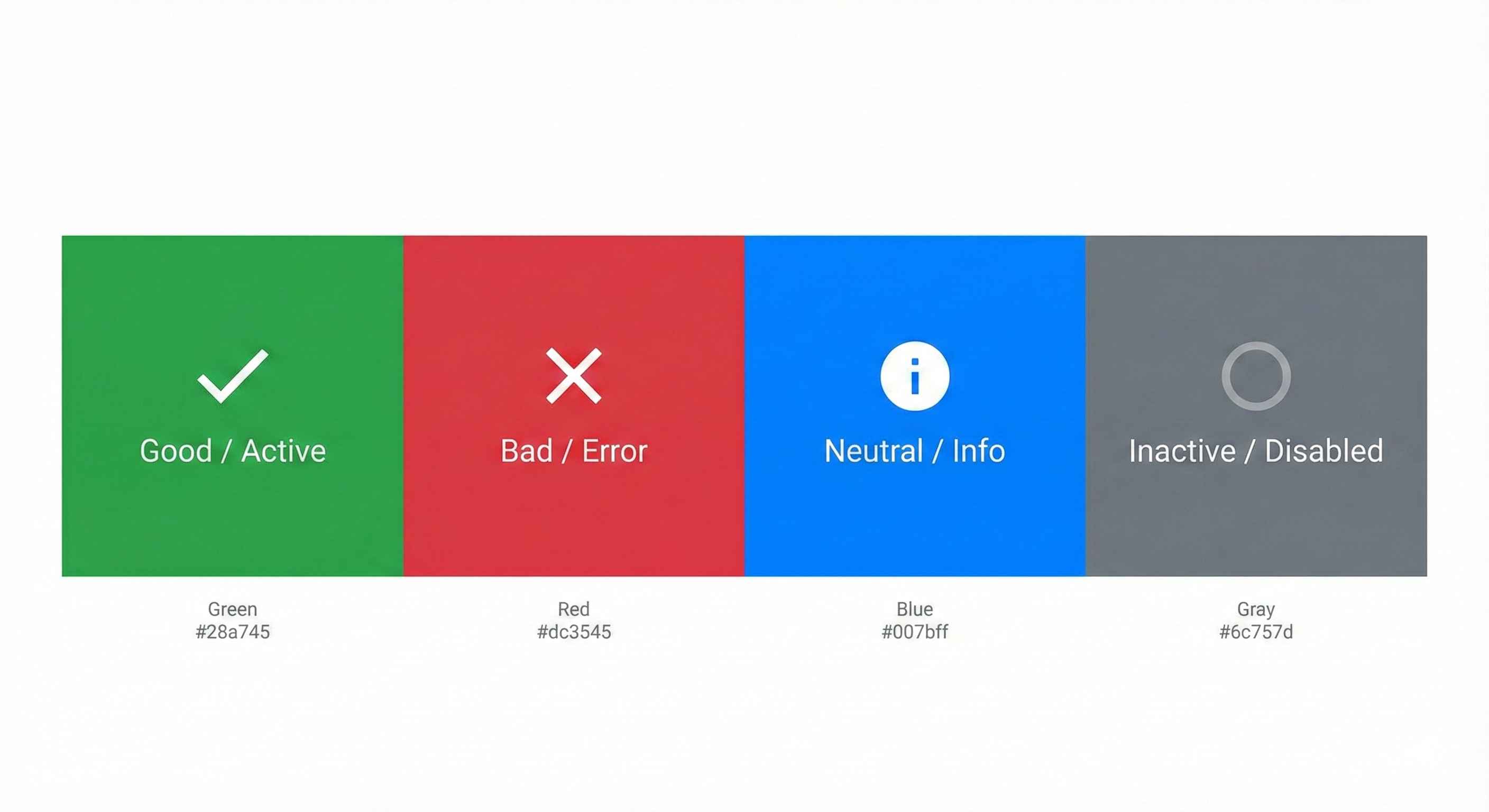
| Color | Meaning |
|---|---|
| 🟢 Green | Good, growth, success |
| 🔴 Red | Bad, decline, alert |
| 🔵 Blue | Neutral, information |
| ⚫ Gray | Reference, inactive |
Rules:
- Use only 3-5 colors
- Be consistent across all pages
- Don't rely on red/green alone (colorblind users!)
Rule 4: White Space is Your Friend
Don't cram everything together!
| Cluttered ❌ | Clean ✓ |
|---|---|
| No gaps between visuals | Breathing room between visuals |
| Text touching edges | Padding around content |
| Feels cramped | Feels professional |
Rule 5: Size = Importance
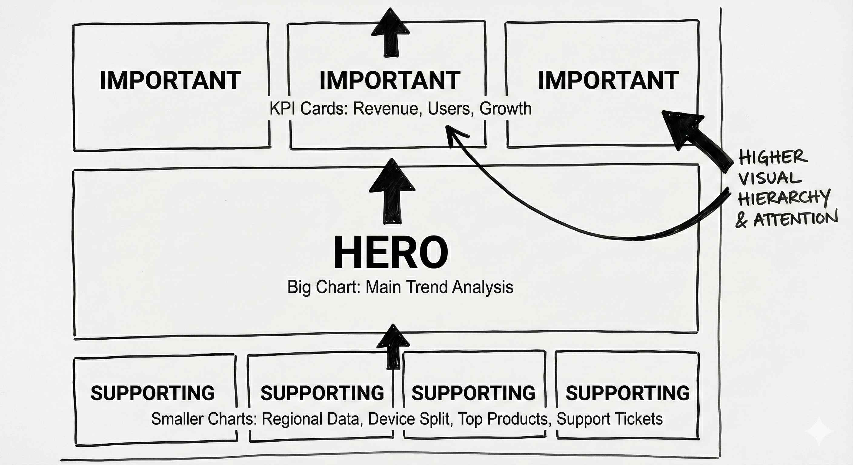
| Visual | Size |
|---|---|
| Key KPIs | Large cards at top |
| Main chart | Biggest visual (hero) |
| Supporting charts | Medium size |
| Details/tables | Smaller at bottom |
Quick Checklist
Before you publish, ask:
- ✅ Can users find key info in 5 seconds?
- ✅ Is the layout clean and aligned?
- ✅ Are colors consistent and meaningful?
- ✅ Does it work on mobile?
- ✅ Is there enough white space?
Try This
Design a sales dashboard:
- Sketch on paper first (seriously!)
- Top row: 4 KPI cards
- Left: Date + Region slicers
- Center: Big line chart (sales trend)
- Bottom: Bar chart (by product)
- Use only 3 colors
- Test on mobile view
Tip: Good design is invisible. Users should focus on data, not the dashboard itself!