Module 7
6 min read
Slicers and Filters
Make your reports interactive with slicers and filters
What You'll Learn
- Create slicers for user interaction
- Understand filter levels
- Make dashboards interactive
What are Slicers?
Slicers let users filter data themselves. Click a button → data changes!
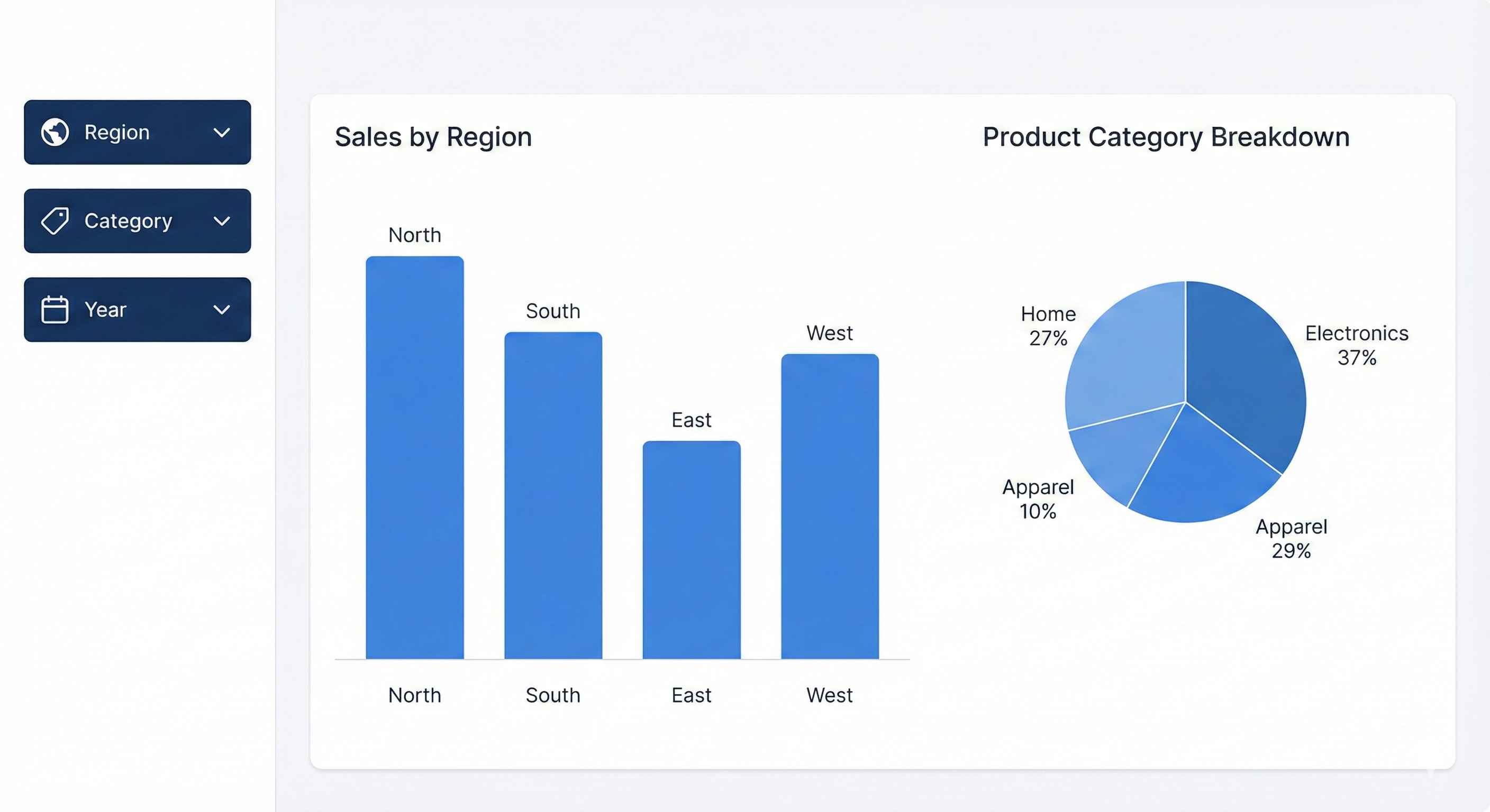
Step 1: Create a Slicer
- Click Slicer icon in Visualizations
- Drag a field (e.g., Region) to the Field well
- Slicer appears on canvas!
Users can now click to filter all visuals.
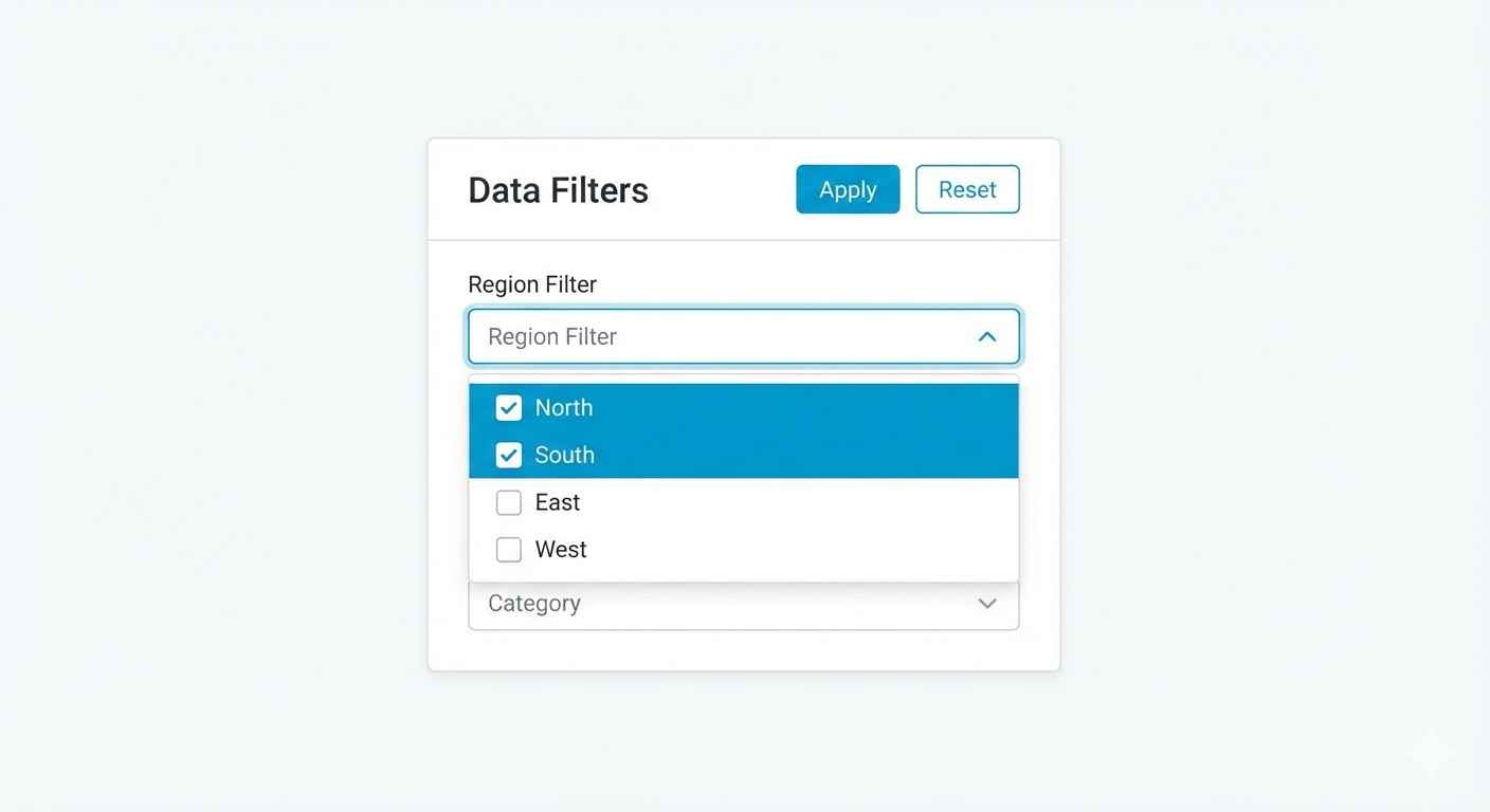
Slicer Types
| Type | Best For |
|---|---|
| List | 3-10 options, see all choices |
| Dropdown | Many options, saves space |
| Date Range | Filter by date period |
| Numeric | Filter by number range |
Change style: Format → Slicer Settings → Style
Step 2: Add Date Slicer
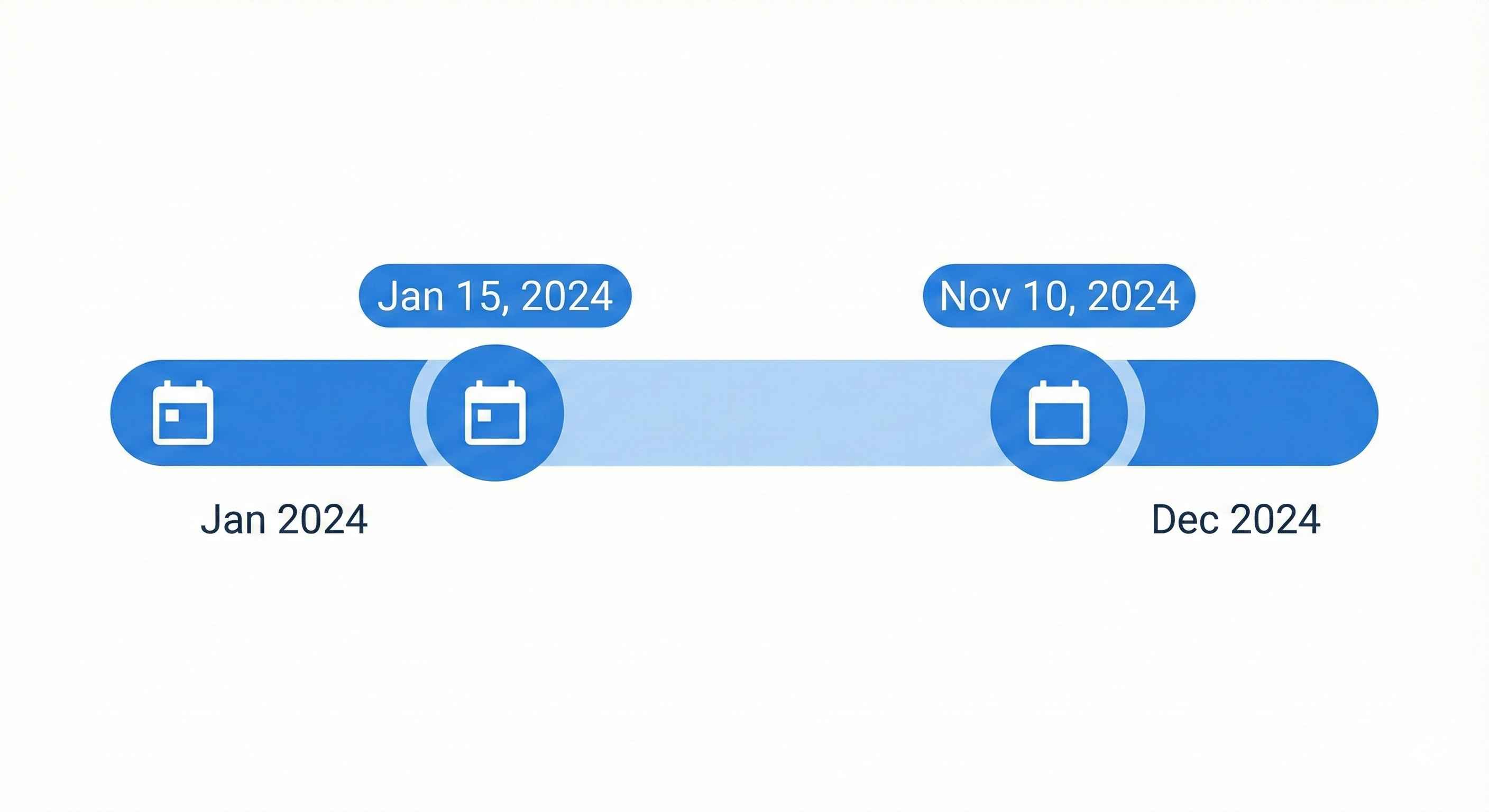
Date slicers are special. Options include:
- Between: Select date range with slider
- Relative: "Last 7 days", "This month", "YTD"
- Before/After: All dates before or after a date
Pro tip: Use Relative Date for auto-updating reports!
Filter Levels
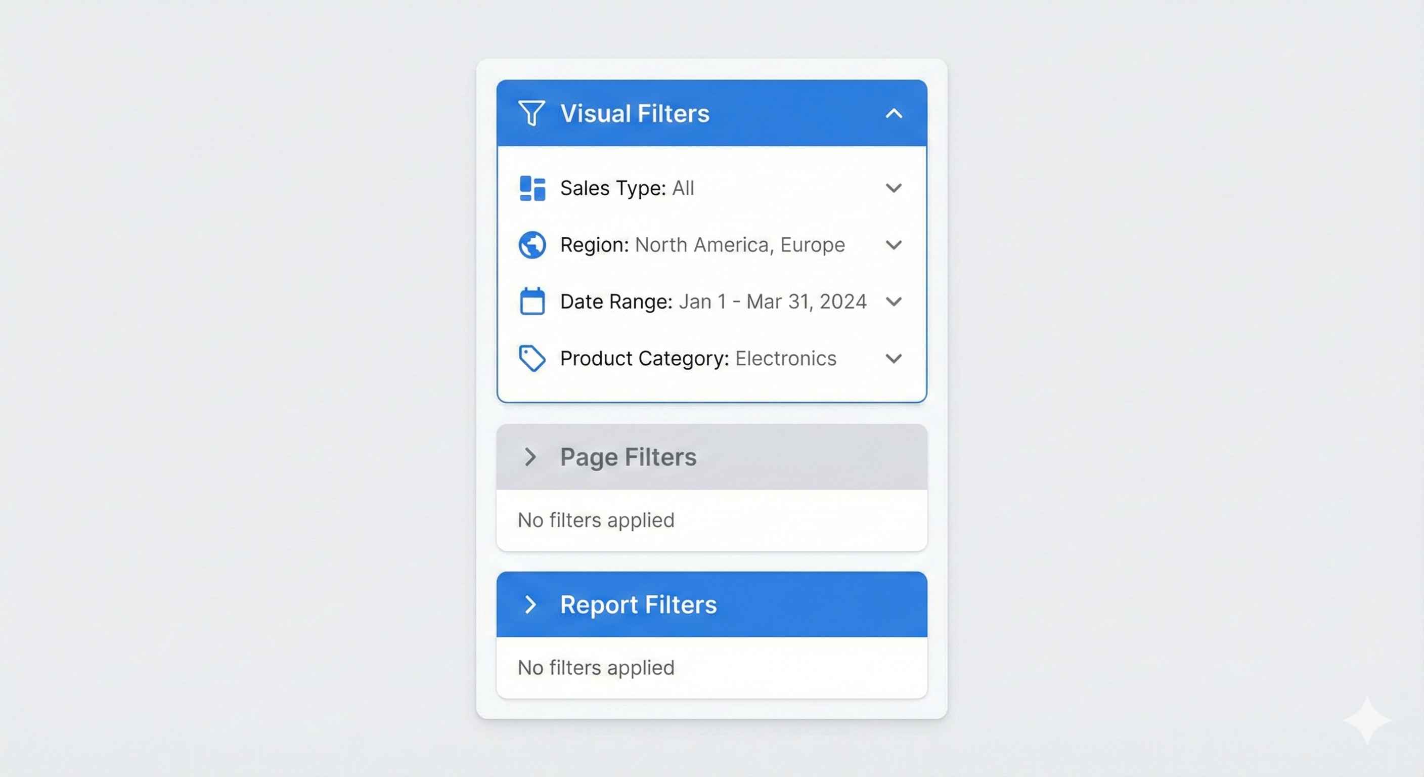
| Level | Affects | Use For |
|---|---|---|
| Visual | One chart only | Top 10 in this chart |
| Page | All visuals on page | This page shows 2024 only |
| Report | All pages | Exclude test data everywhere |
Find in: Filters pane (right side)
Cross-Filtering
When you click one visual, others filter automatically!
Example: Click "North" on bar chart → pie chart shows only North data
Control it: Format → Edit Interactions
- Filter (apply filter)
- Highlight (dim other data)
- None (no effect)
Best Practices
| Do | Don't |
|---|---|
| Place slicers at top/left | Hide slicers |
| Limit to 5-7 slicers | Add 15 slicers |
| Use dropdown for long lists | Show 100 items in list |
| Enable search on slicers | Make users scroll forever |
Try This
- Add Region slicer (dropdown style)
- Add Date slicer (relative: This Year)
- Add Category slicer (list with search)
- Create a bar chart and card
- Click slicers → watch data change!
Tip: Less is more. Too many slicers = confused users!