Charts & Visualizations
Create professional charts to visualize your data
Charts & Visualizations - Turn Numbers Into Pictures
A picture is worth 1000 numbers! Charts make data easy to understand at a glance.
Why Use Charts?
Data in table:
| Month | Sales |
|---|---|
| Jan | 100 |
| Feb | 150 |
| Mar | 200 |
| Apr | 180 |
| May | 220 |
Hard to see the pattern, right?
Same data in chart: One glance shows sales going UP! 📈
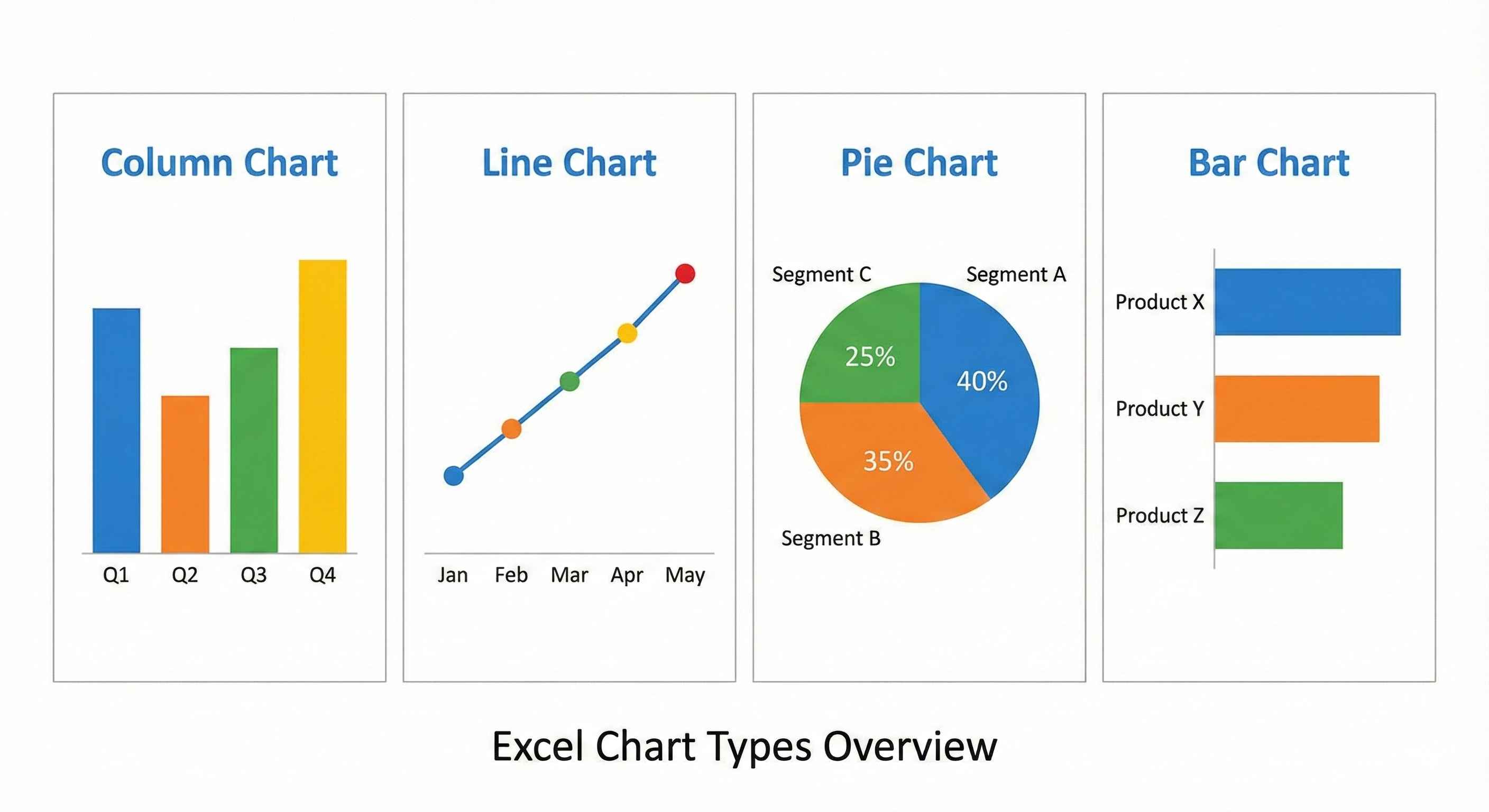
Chart Type 1: Column Chart
Use when: Comparing different things
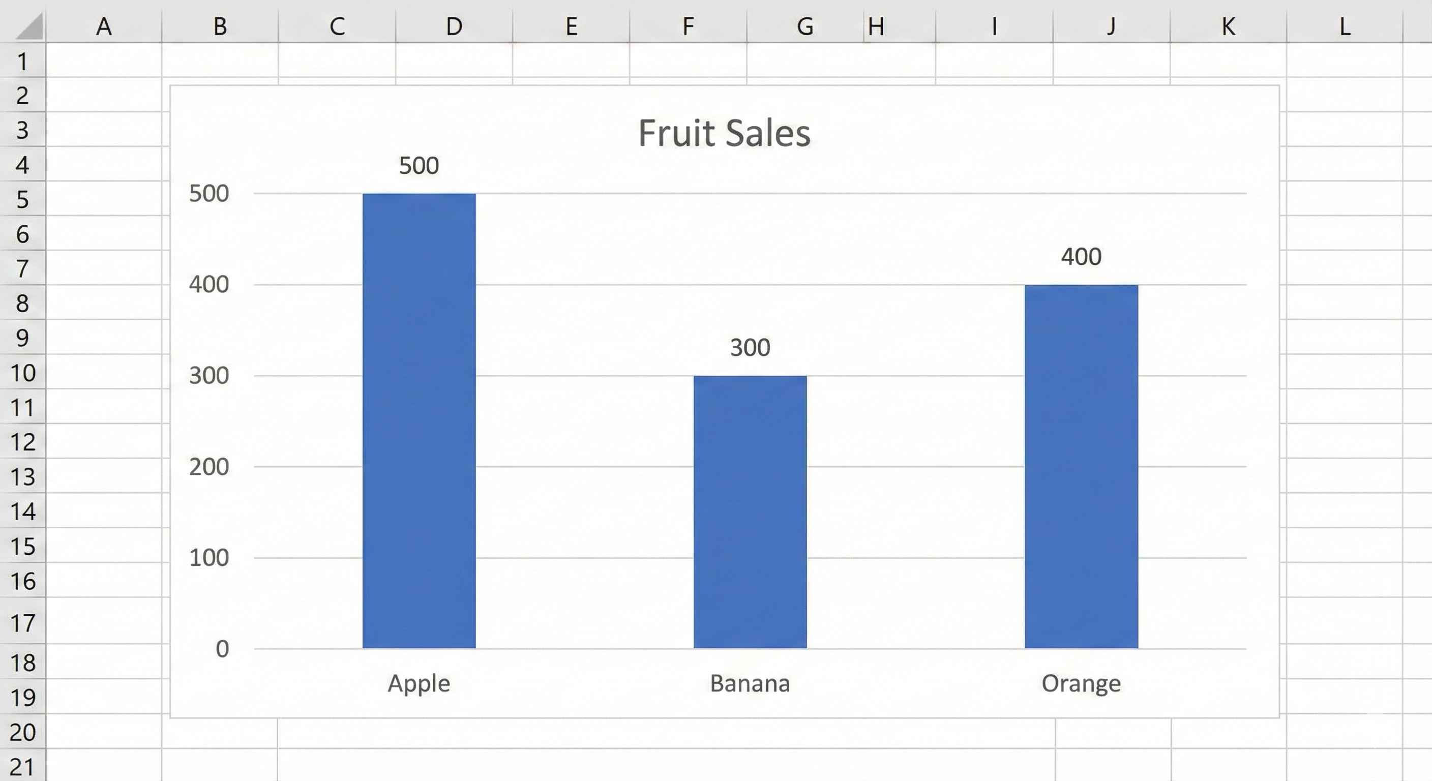
Example
| Product | Sales |
|---|---|
| Apple | 500 |
| Banana | 300 |
| Orange | 400 |
Column chart shows: 3 vertical bars. Apple is tallest!
Perfect for:
- Sales by product
- Scores by student
- Revenue by region
Chart Type 2: Line Chart
Use when: Showing change over time
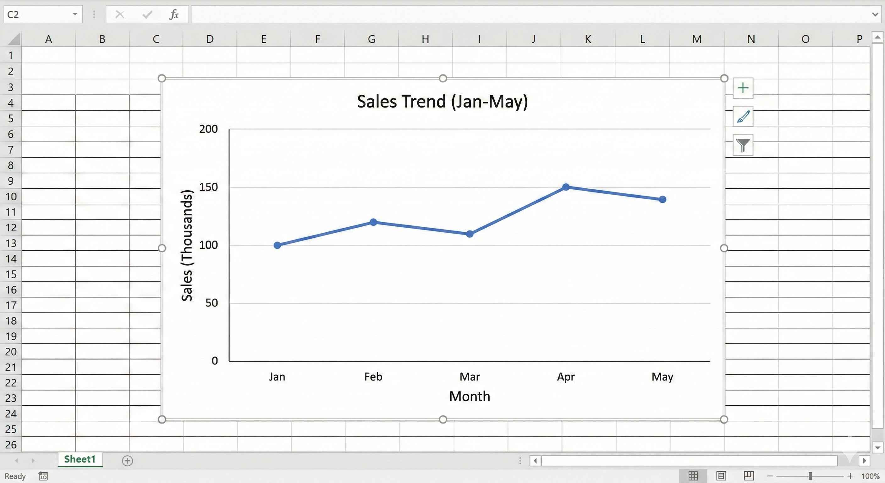
Example
Sales over 5 months: Line connects the dots, you see the trend!
Perfect for:
- Monthly sales
- Stock prices
- Temperature over days
- Website visitors
Rule: X-axis must be time (days, months, years)
Chart Type 3: Pie Chart
Use when: Showing parts of 100%
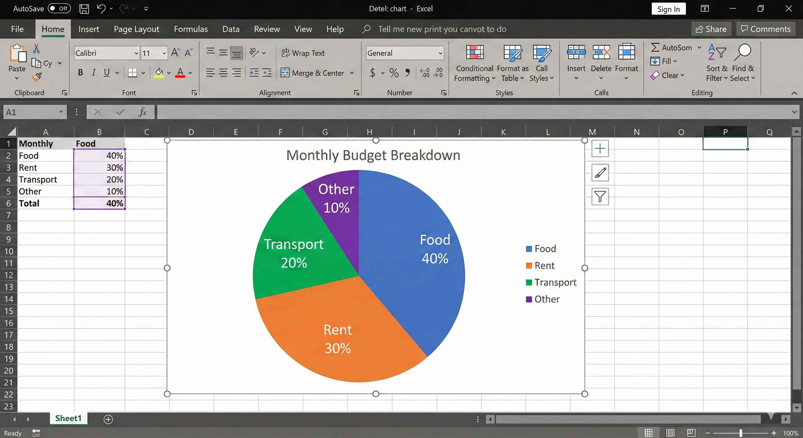
Example
Budget breakdown:
- Food: 40%
- Rent: 30%
- Transport: 20%
- Other: 10%
Total = 100%
Perfect for:
- Market share
- Budget categories
- Survey results
Important Rules:
- Use 5 or fewer slices
- Must add up to 100%
- Don't use for time trends
Chart Type 4: Bar Chart
Same as column chart, but horizontal!
Use when: Category names are long
Example: "Customer Service Department" is too long for column chart. Use bar chart instead!
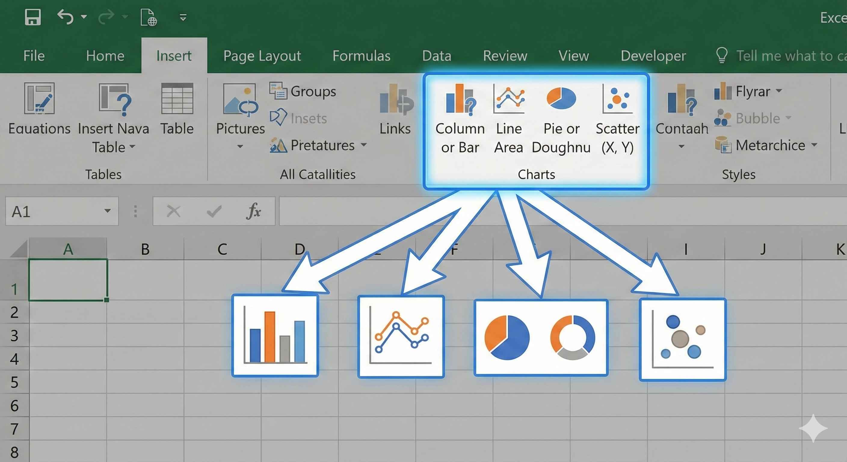
How to Create a Chart
Step 1: Select your data (include column headers!)
Step 2: Click Insert tab
Step 3: Choose chart type
Step 4: Done! Chart appears
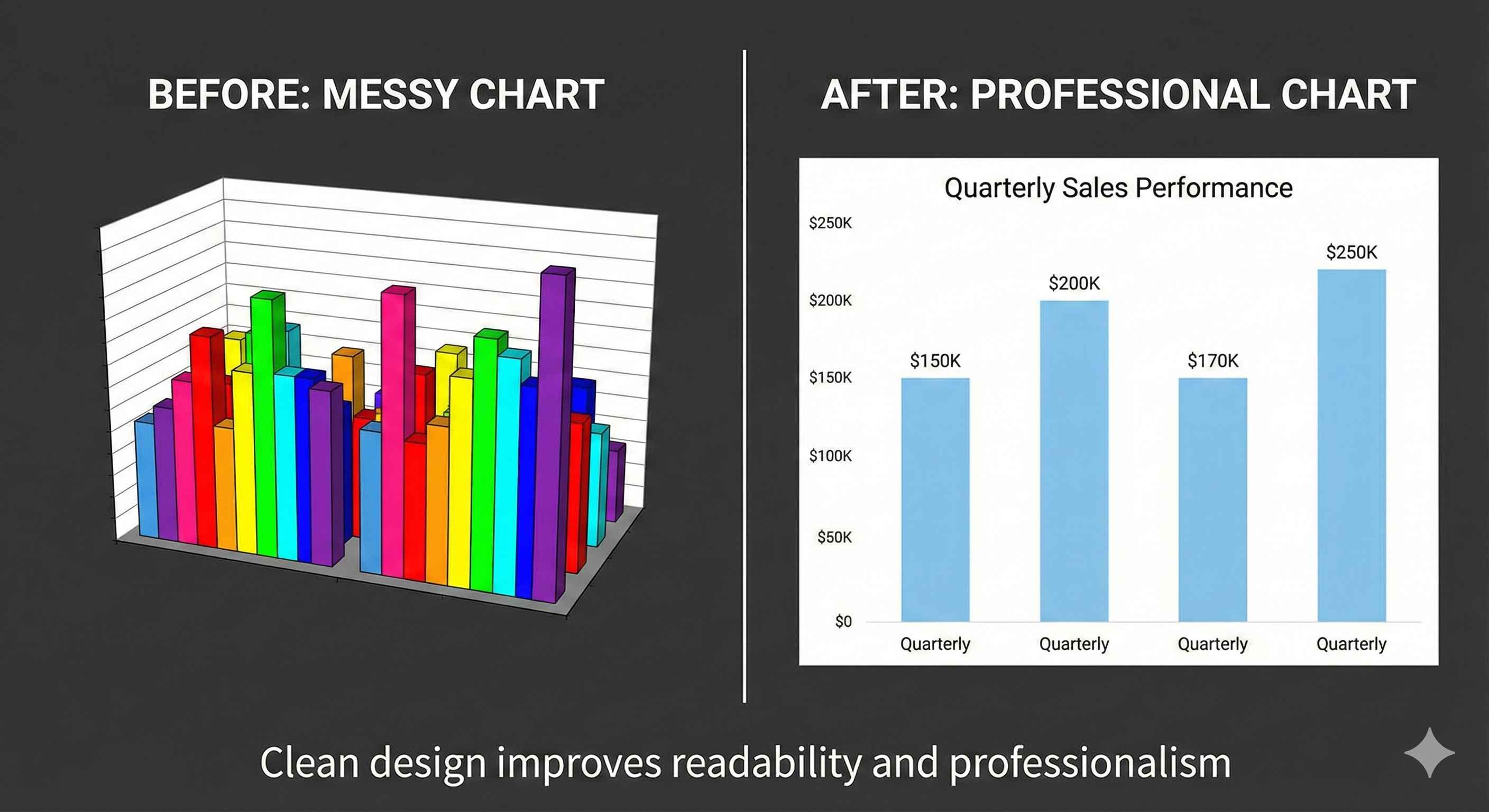
Make Charts Look Professional
1. Add Clear Title
Click chart title, type: "Sales by Product 2024"
Good: "Monthly Revenue Jan-May" Bad: "Chart 1"
2. Add Data Labels
Shows numbers on bars/lines
Click chart → Click + button → Check "Data Labels"
3. Use Simple Colors
- 2-3 colors maximum
- Green = good
- Red = bad
- Avoid rainbow colors!
4. Remove Clutter
- No 3D effects
- Remove extra gridlines
- Keep it clean and simple
Quick Chart Selector
| I want to... | Use this chart |
|---|---|
| Compare products/people/things | Column or Bar |
| Show trend over time | Line |
| Show parts of 100% | Pie |
| Compare with long names | Bar (horizontal) |
Common Mistakes
| Mistake | Why It's Bad | Fix |
|---|---|---|
| Too many items in pie chart | Hard to read | Use 5 or fewer slices |
| Using pie for trends | Wrong chart type | Use line chart for time |
| 3D charts | Look cool but confusing | Always use 2D |
| No title | Unclear what chart shows | Add descriptive title |
| Too many colors | Looks messy | Use 2-4 colors max |
Summary
Column Chart: Compare things (vertical bars)
Line Chart: Show trends over time
Pie Chart: Show parts of 100%
Bar Chart: Like column, but horizontal (for long names)
Always:
- Pick right chart for your data
- Add clear title
- Keep it simple
- Use 2-4 colors
Charts make your data tell a story!